-
-
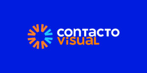
The Contacto Visual logo featuring the eye-inspired symbol, with “Contacto” in white and “Visual” in orange on a blue background.
-
-
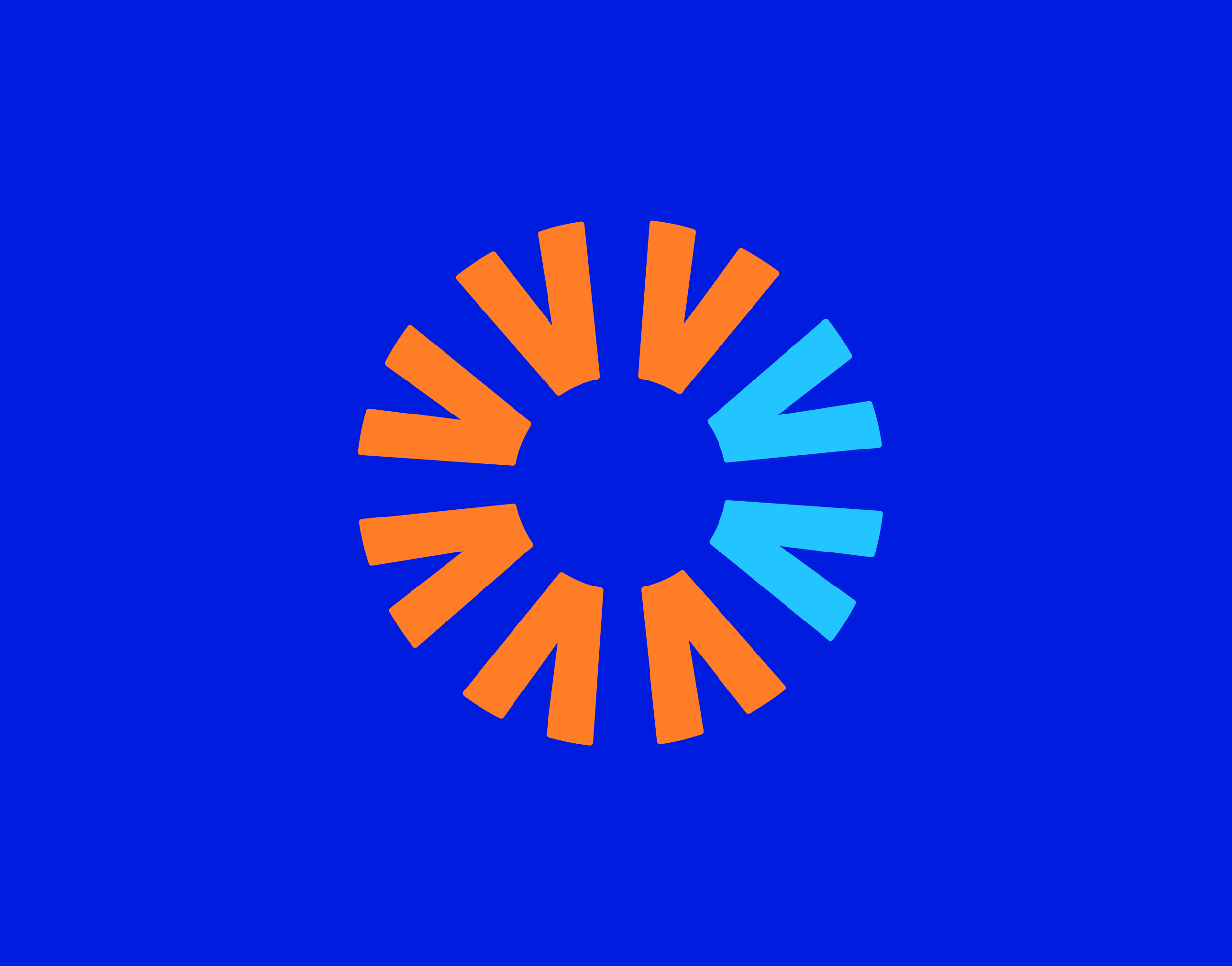
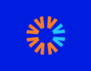
A geometric symbol composed of eight V-shapes forming a circular iris, representing vision and clarity.
-

-
A young woman smiling while wearing glasses and a white blouse, set against the Contacto Visual brand texture.
-
-
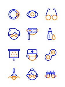
A set of 12 custom-designed icons representing ophthalmology services and patient care.
-

-
A professional ophthalmologist holding an optical diagnostic device, highlighting expertise in vision care.
-
-
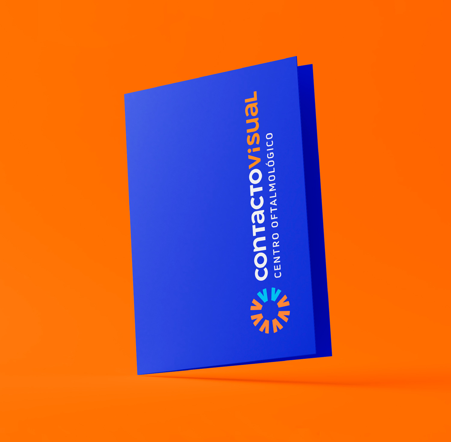
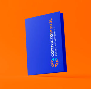
A navy blue folder with the Contacto Visual logo, set against an orange background.
-

-
A smiling child wearing glasses and a striped t-shirt, standing in front of the Contacto Visual brand texture.
-
-
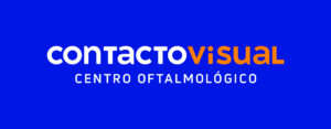
The Contacto Visual logo with its full name and “Centro Oftalmológico” tagline, reinforcing its medical expertise and professionalism.
-
-
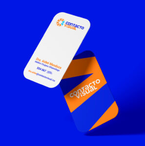
A set of business cards featuring Contacto Visual’s corporate texture on the front and essential contact details on the back.
-

-
A young woman wearing glasses, adjusting them with both hands, reflecting confidence and clarity.
-

-
Two branded referral sheets placed on an orange background, designed for seamless patient communication.
-
-
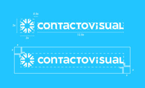
A detailed grid showing the proportions and construction of the Contacto Visual logo for consistent branding.
-
-
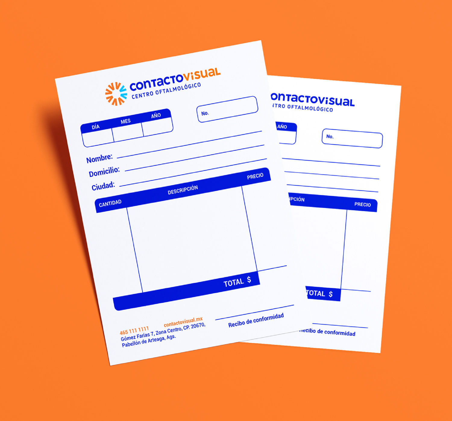
A set of three prescription sheets placed on a blue background, maintaining the brand’s visual consistency.
-
-
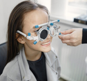
A smiling young girl during an eye exam, showcasing the importance of early vision check-ups.
-
-
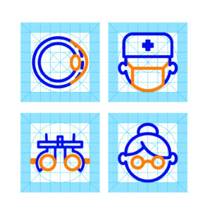
Four ophthalmology-related icons—an eye, a doctor, an optical device, and a woman wearing glasses—shown with their construction grid.
-
-
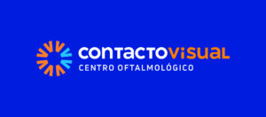
The Contacto Visual full logo features an orange and blue iris-like symbol, with the clinic’s name and tagline in white and orange on a blue background.
-

-
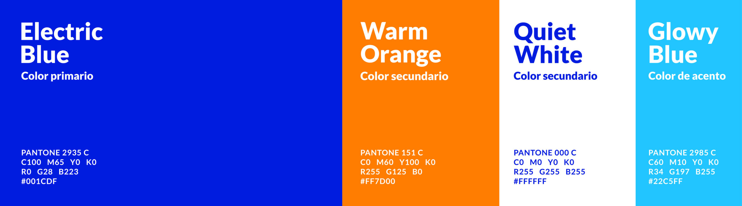
A selection of carefully chosen brand colors reinforcing the warmth and accessibility of Contacto Visual.
-

-
An older man wearing glasses and a hat, leaning on a wooden surface, enjoying a moment outdoors.
-
-
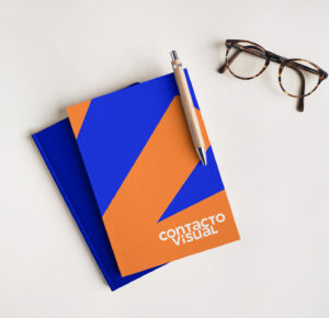
A navy blue branded notebook with Contacto Visual’s logo and corporate texture, placed on a white surface beside eyeglasses.
-

-
A young student wearing glasses sits at a desk, writing in a notebook, emphasizing the importance of eye care for learning.
-
-
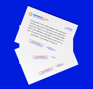
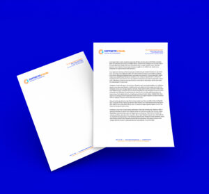
Two branded letterhead sheets, one featuring a formal letter and the other showcasing the design layout.