
The Best Color for My Brand? A Simple Decision Guide
If you’re wondering “what’s the best color for my brand?” you’re not alone. Color isn’t decoration; it’s a decision that shapes first impressions, legibility, and trust. Moreover, the right palette will support your logo, your website, and your packaging—while the wrong one will fight your message at every step.
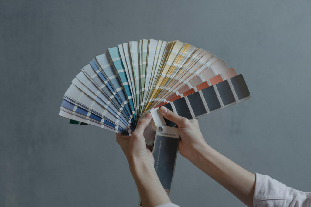
Why Color Matters (More Than You Think)
Color sets tone before words do. Therefore, it should reflect positioning (who you are), audience (who you serve), and context (where your brand lives: web, print, dark mode, packaging). Additionally, strong contrast improves accessibility, which quietly reads as “premium” and “professional.”
What good brand color decisions look like:
- One decisive accent + dependable neutrals.
- High contrast for text and buttons (dark-on-light or light-on-dark).
- Consistent usage across web, social, and print.
- Cultural fit for the regions you target (EU first, then US/CA).
For a deeper dive, explore Psychology of Colors in Branding: How to Influence Your Audience and How to Align Your Visual Identity With Your Brand Values.
Best Color for My Brand: Quick Criteria
Use these criteria to shortlist colors fast. Consequently, you’ll move from “I like it” to “it works.”
- Positioning fit: Does the color signal your brand’s role (e.g., precision, warmth, creativity)?
- Audience expectations: Will your segment read it as credible or gimmicky?
- Legibility & contrast: Will it pass contrast checks on light and dark backgrounds?
- Photography harmony: Will it complement your imagery, not clash?
- Scalability: Will it still feel right in a year as you add new assets?
The 3–Color Rule (That Actually Scales)
Although complex palettes can look attractive, simplicity wins long-term.
- Neutral base: off-white / warm gray / graphite.
- Core dark: for text, icons, and body copy.
- One accent: the emotional color that carries buttons, highlights, and moments of emphasis.
Why just one accent? Because it focuses attention and prevents mixed signals. In other words, fewer colors → clearer hierarchy → faster comprehension.
Industry Cues (Without Stereotypes)
Context matters; use these as starting points, not cages.
- SaaS / Fintech: deep blues, charcoals, or emeralds → clarity and trust.
- D2C / Lifestyle: warm neutrals + a confident accent → approachable and premium.
- Food & Beverage: saturated, appetizing accents (tomato, saffron, basil) → energy and taste.
- Health & Wellness: fresh greens, soft blues, or calming neutrals → care and balance.
- Creative Services: restrained neutrals + distinctive accent → memorable, not noisy.
From Moodboard to Palette (A 20-Minute Sprint) ✍️
Because speed reduces indecision, set a timer and try this now.
- Collect 8–10 images that feel like your brand (not just logos).
- Label each image with one adjective (calm, bold, refined, playful).
- Sample colors from the images and group them into neutrals and accents.
- Pick one accent that supports your adjective set.
- Test contrast on both light and dark backgrounds.
- Apply to a hero section (headline, subhead, button) to see if it still sings.
Web Reality Check (So It Works in the Wild)
A color that looks perfect on a swatch can fail on screen. Therefore, run these quick tests:
- Dark mode: Does your accent pop without vibrating?
- Buttons: Is the CTA readable and decisive?
- Forms: Are error/success states clearly distinguishable?
- Images: Does the accent complement, not compete, with photography?
- Mobile: Does everything remain legible at small sizes?
Common Color Mistakes (And Easy Fixes)
Too many accents → trim to one; demote extras to neutrals.
Low contrast → darken text or lighten backgrounds; accessibility builds trust.
Trendy palettes only → verify use cases (hero, buttons, cards) before committing.
Ignoring print → proof a small print piece; some colors shift off-screen.
Clashing with imagery → choose photos that share temperature and tone.
Mini Palette Recipes (Founder-Friendly)
Try these as starting points; then refine for your voice.
- Calm Premium: Warm gray base + charcoal text + muted teal accent.
- Confident Modern: Soft linen base + near-black text + electric blue accent.
- Warm Craft: Porcelain base + cocoa text + terracotta accent.
- Fresh Wellness: Mist base + slate text + leaf green accent.
When to Change Colors (Rebrand vs Refresh)
If your current palette blocks legibility, clashes with real-world photos, or confuses your message, consider a refresh. However, if color problems come with a broader shift—new market, new promise, new audience—then a rebrand may be smarter. For step-by-step guidance, see “Thinking About Rebranding? Here’s the Rebrand Checklist You Need.”
Choosing the best color for my brand isn’t about guessing; it’s about fit, contrast, and consistency. Moreover, once you pick an accent and protect it with simple rules, everything else—typography, buttons, and imagery—falls into place. Consequently, your brand looks clear, composed, and memorable.
Need a brand-first color decision you can use tomorrow? Book a short consultation and I’ll help you pick the right palette, test contrast, and apply it across web and social—fast, clear, and on-brand.
No responses yet