
Templates vs Custom: What Your Social Graphics Really Need
If you’re researching social media graphics for small business, you’re likely choosing between fast templates and fully custom visuals. Both can work. However, the right choice depends on your goals, your timeline, and—most importantly—your brand consistency. Moreover, the smartest teams rarely choose just one; they use a hybrid.
The Real Question: What Are You Optimizing For?
Speed and budget are valid. Nevertheless, distinctiveness, readability, and trust are what win attention. Therefore, decide whether this campaign needs velocity (templates), differentiation (custom), or a blend tailored to your stage.
When Templates Win (and How to Make Them Look Premium)
Templates shine when you need volume and rhythm.
- Speed: publish consistently without design bottlenecks.
- Cost control: spend time where it matters most (launches, ads, hero posts).
- Ease of use: your team can edit text and swap images safely.
Make templates feel custom:
- Map your brand kit first (colors, type, logo spacing).
- Lock an 8-pt spacing rhythm so every post breathes.
- Define image style (light, candid, minimal) and stick to it.
- Write microcopy that sounds like you—no filler, just verbs.
Helpful companion: see make your website look professional for quick visual moves that also elevate social.
When Custom Graphics Win (and Why They Pay Off)
Go custom when you need standout impact.
- Brand moments: product launches, partnerships, events.
- Complex stories: carousels, data, motion-first concepts.
- Signature look: assets you’ll reuse across channels.
Because custom work matches your voice and structure precisely, it often converts better and lives longer. Consequently, your feed looks intentional—not template-first.
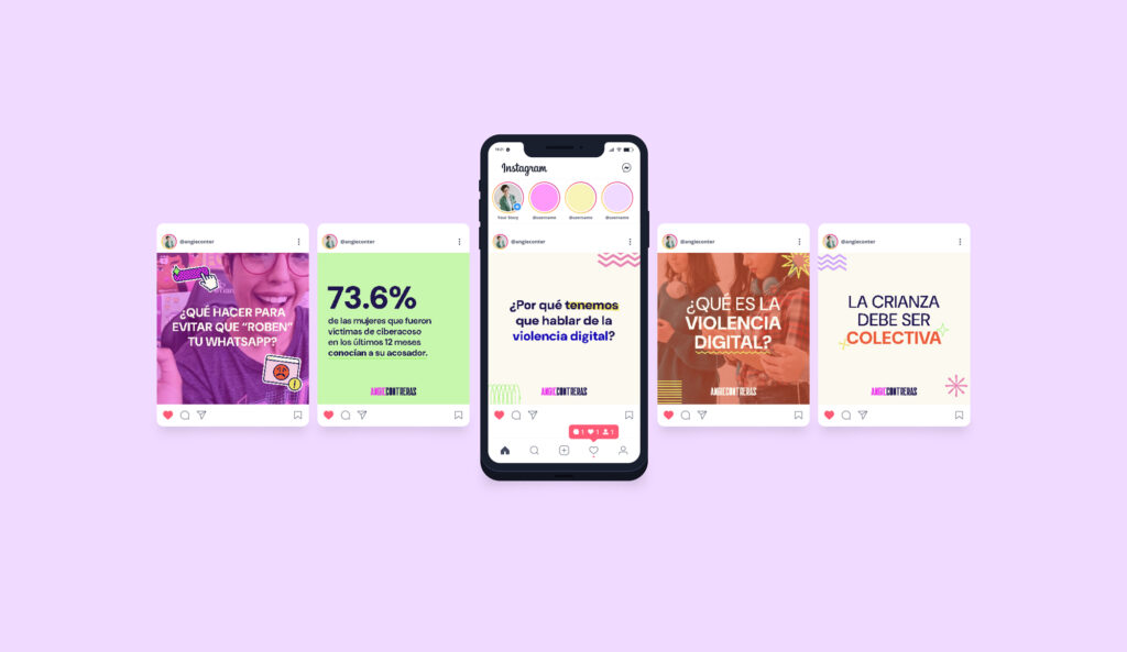
Social Media Graphics for Small Business: The Hybrid Strategy
Use the 70/20/10 model for momentum and distinctiveness:
- 70% templated basics: quotes, tips, announcements.
- 20% tailored templates: same layout, but with upgraded type/imagery.
- 10% bespoke heroes: custom-design posts for campaigns and ads.
This mix protects your calendar while giving you room to wow when it counts.
A Simple Visual Quality Checklist (Save It ✅)
Although platforms differ, great posts share fundamentals. Therefore, before you publish, check:
- Hierarchy: clear headline, short body, obvious CTA.
- Contrast: readable on both light and dark UI.
- Spacing: consistent margins/padding; no cramped corners.
- Logo safety: minimum size + clear space; avoid bottom-right clutter.
- File hygiene: crisp exports, correct ratios, sensible names.
Want inspiration for elegant restraint? Browse minimal logo design that stands out.
Template Setup That Doesn’t Look “Template”
Because details sell the illusion of craft:
- Lock typography pairs (one for headlines, one for body).
- Choose one accent color; demote the rest to neutral roles.
- Build three reusable layouts (quote, tip, promo) instead of twenty.
- Create brand frames for photography so everything feels related.
- Document do/don’t (max lines per slide, safe areas, image tone).
Custom Without Chaos: A Lightweight Brief
You don’t need a huge document. Nevertheless, clarity speeds everything up.
- Goal: what should a viewer do after seeing this?
- Audience & channel: who and where (IG feed, LinkedIn, stories).
- Message: one sentence, then supporting bullet.
- Constraint: ratio, character limit, date, or mandatory element.
- Reference: one visual example (tone, not copy).
Tight on copy? Revisit Brand Voice 101: Find the Right Tone for Your Brand to align words with visuals.
Time & Budget: What to Expect (Guidance, Not a Quote)
- Template kit (3–5 layouts): fast to produce; perfect for weekly cadence.
- Tailored template upgrades: moderate time; noticeable polish.
- Bespoke hero sets: higher effort; planned for launches or ads.
Consequently, your spend follows impact, not just output.
15-Minute Feed Audit (Run It Today) 🕒
Because action beats theory:
- Scroll nine posts. If headlines jump around, fix type sizes.
- If buttons blend into backgrounds, raise contrast immediately.
- If two or more color accents fight, keep only one accent live.
- If photos feel random, define a temperature (warm/cool) and crop style.
- Re-export anything fuzzy; pixel-sharp assets read as professional.
Templates keep you consistent. Custom work makes you unforgettable. Therefore, choose a hybrid that respects your reality and your ambition. Moreover, protect the basics—type, spacing, color, contrast—and your social presence will look intentional, credible, and on-brand. ✨
Want a plug-and-play kit plus a few show-stopping heroes? I’ll tailor a small-business set of social media graphics—templates for cadence, custom assets for impact—so you can post with confidence and grow.
No responses yet