
Latinas en Alemania: Website Redesign Case Study (Wix) — From Informative to Human
When a community grows, its website must grow with it. This Wix website redesign began with a simple truth from the founder of Latinas en Alemania: “Our site no longer reflects who we are.” The platform informed, yes — but it didn’t connect. Therefore, our goal was not only to refresh pages; it was to realign story, structure, and visuals so the site could feel human, clear, and alive.
Project at a Glance
Author: Monserrat Urueña @ adamanto, with collaboration from Sharon Peredo Sahid
Website: www.latinasenalemania.com
Year: 2025
Platform: Wix
Scope: Communication strategy · Brand voice · Information architecture · Visual system · Multilingual rollout (ES/DE/EN)
The Before: A Gap Between Brand and Website
Latinas en Alemania had already modernized its identity: a broader palette (pinks, blues, yellows, oranges) and fresh typefaces. However, the website still carried an older look and tone. As a result, three core issues emerged:
❌ Visual–digital mismatch: the identity felt updated; the site did not.
❌ No brand voice online: copy was informative but distant, which reduced emotional connection.
❌ Redundant navigation: pages overlapped; the menu lacked hierarchy and intuition.
Consequently, even loyal users struggled to find information — and new visitors didn’t feel invited in.
Strategy First: Diagnose, Then Design
Before touching visuals, we ran a communication audit across content, UX, and accessibility. This revealed exactly where the site needed to shift. Then we created a foundation piece:
📕 The “Brand Voice & Storytelling” Document
Because the community already had a warm tone on social media, we formalized it for the website. The document defined:
👉🏼 Tone: professional, empathetic, and close.
👉🏼 Narrative principles: per section (Home, About, Services, etc.).
👉🏼 Emotional arc: how each page should make visitors feel.
This became our guide for structure, microcopy, and calls to action. For background on why alignment matters, see Why Your Website Must Match Your Branding.
💬 Architecture & Content: From Maze to Map
Next, we reorganized the information so users could move with ease.
✅ Simplified main menu with clear categories and fewer layers.
✅ Consolidated pages to remove duplication and reduce cognitive load.
✅ CTA strategy that invited action (join, collaborate, attend, contact) without pressure.
✅ Inclusive language and clear labeling to support first-time visitors.
Because structure carries the story, this alone made the site feel calmer and more helpful.
💻 Visual System on Wix: Human, Warm, and Consistent
With strategy in place, design could finally speak. We implemented:
🔸 Expanded color palette across sections to express diversity without chaos.
🔸 Modern type pairing for readability and personality.
🔸 Photography direction that feels real and welcoming.
🔸 Component library (buttons, cards, banners) to keep consistency page to page.
Wix enabled quick iteration; nevertheless, we documented usage so future updates stay coherent. If you’re deciding how visuals and brand should meet, 5 Reasons Why Your Business Needs a Brand Strategy is a helpful companion read.
Beyond the Plan: Pages the Community Needed
As the project evolved, new needs surfaced. Therefore, we added high-value subpages:
⭐️ Collaborations: clear paths for volunteering, sponsorships, and alliances.
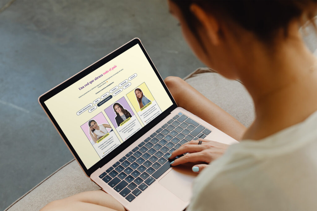
⭐️ Services in Berlin: a curated space to highlight Latin professionals offering in-person services.
⭐️ WhatsApp Communities: join local groups via direct links and QR codes — bridging digital and in-person support.
Each page combined concise copy with purposeful design so users could act immediately.
Page Highlights
🔹 Home — reframed as an emotional introduction: who we are, how we help, and where to start.
🔹 About us — mission and story told visually and narratively, not as a static bio.
🔹 Services — packages and memberships integrated for direct purchase, which reduced friction.
🔹 Mental Health Chat — a safe, clearly structured space with warm visuals and supportive language.
🔹 Events — an “alive archive”: upcoming activities plus meaningful moments from the past.
🔹 Contact — one place for all interactions (general messages, proposals, donations).
During implementation, Sharon supported design and led translation to German and English, ensuring inclusivity for a broader audience.
Accessibility: Clarity Is Care
Because the community is diverse, we prioritized inclusive design:
✅ Contrast-checked color pairs for readability.
✅ Consistent heading structure for screen readers.
✅ Alt text and descriptive links that explain purpose.
✅ Mobile-first decisions so the site works where users actually visit.
These details seem small; however, together they build trust and usability.
Results: From Informative to Human
After launch, the website felt like the community it represents. While numbers will evolve over time, the immediate qualitative outcomes were clear:
✅ Visual–narrative coherence: colors, voice, and layout finally tell the same story.
✅ Smoother UX: simpler menu and clearer paths increased engagement.
✅ Active participation: pages invite joining, collaborating, and attending — not just reading.
✅ Professional presence: the site now communicates purpose and credibility.
This is what a Wix website redesign can do when it starts with strategy and ends with consistent execution.
For teams planning a larger shift, my Rebrand Checklist offers a step-by-step lens to keep decisions aligned.
A Public Moment: Launch at the Embassy
Six months after kickoff, we presented the new site during the 11th anniversary of Latinas en Alemania, hosted at the Embassy of Mexico in Germany (Berlin). I shared the project alongside Sharon Peredo Sahid. The response highlighted:
✔️ A more professional, trustworthy image
✔️ Clear structure and human tone
✔️ A site that reflects growth and supports participation
Beyond a launch, it was a recognition of community work — and of the power of design that listens first.
Lessons You Can Apply to Your Own Site
👉🏼 Start with voice. If words don’t fit, visuals won’t fix it.
👉🏼 Redesign the map, not only the paint. Architecture shapes behavior.
👉🏼 Design systems, not pages. Reusable components keep coherence.
👉🏼 Add what people actually need. New pages emerged from real use cases.
👉🏼 Translate for belonging. Language access is a design choice.
This project wasn’t just a new look. It was a realignment of identity, structure, and voice — a website that cares for its users and mirrors a community’s growth. Ultimately, that’s the point: a site that not only informs, but also welcomes.
If your website no longer feels like your brand — or your community — let’s talk. I design strategy-first websites that look beautiful and behave beautifully. ✨ Explore my Brand Strategy, Brand Identity, and Web Design approach on the services page.
No responses yet