
How to Choose Brand Colors That Don’t Look Generic
If you’re building a palette and nothing feels distinctive, you’re probably asking how to choose brand colors that don’t look like everyone else’s. The truth is, most palettes fail not because the hues are “wrong,” but because the system behind them is missing — roles, ratios, and rules. In this guide, we’ll build a color system that stands out, remains accessible, and still fits your category.
Why Most Brand Palettes Look Generic (and How to Avoid It)
Trends make it easy to blend in. Wellness brands default to soft greens, tech companies to safe blues, and luxury to black-and-gold. However, clichés happen when brands copy palettes without intent. Instead, start by clarifying what you want people to feel. Then translate emotion into color decisions. Consequently, you’ll design a palette that signals your category while still being unmistakably yours.
Two principles to remember:
✅ Recognition vs. differentiation: You can nod to the category and bend the rules.
✅ System over favorites: A palette is a toolkit, not a moodboard of five pretty swatches.
How to Choose Brand Colors with a Simple, Non-Generic Method
Use this fast method to go from mood to a functional palette in under an hour.
1️⃣ Start with three mood words
Pick three words that capture your brand’s feeling (e.g., grounded, inventive, warm). Because words guide decisions, they keep you honest when choosing hues.
2️⃣ Select a primary hue that matches the mood
If you’re grounded, you may lean earthy (teal, terracotta). If you’re inventive, you may go brighter (electric cyan, citrus). Moreover, check competitors; then shift temperature or saturation to avoid clones.
3️⃣ Build roles: primary, neutrals, accent, and states
- Primary (1): Carries headlines, key shapes, and hero spaces.
- Neutrals (2–3): Backgrounds and large surfaces (off-white, warm gray, ink).
- Accent (1): For CTAs, highlights, and data points.
- States (2): Success / warning for UI or forms.
Because each color has a job, the palette performs consistently across touchpoints.
4️⃣ Set ratios so the palette behaves
Use the 60/30/10 rule: neutrals ≈60%, primary ≈30%, accent ≈10%. Therefore, your site never looks “too colorful,” and your accent keeps its power.
5️⃣ Define tints, shades, and contrast pairs
Pick at least two contrast-safe pairs for text on backgrounds (e.g., ink on soft-ivory; white on deep-navy). Then note which combos are never allowed. This prevents accidental accessibility issues later.
Stand Out Without Confusing Your Market
You don’t need to abandon category cues to look original. Instead, twist the stereotype:
- Change temperature: If everyone is cool teal, try a warm blue-green.
- Adjust saturation: If the space is neon, go mineral and muted.
- Play with contrast: Pair a quiet primary with a bold accent only you would choose.
- Shift the anchor: Keep the expected hue, yet pair it with an unexpected neutral (e.g., mushroom, slate-lavender, or inky green).
Small shifts create big distinction — and clients will feel it immediately.
Accessibility First: Make It Readable and Inclusive
Readable color is non-negotiable. Moreover, accessibility helps SEO, conversion, and trust.
- Contrast: Aim for WCAG AA contrast for body text. Because buttons drive revenue, prioritize their contrast first.
- Scale: Increase font size or weight when contrast is borderline.
- Overlays: If using color over photography, add a subtle scrim. Then test again.
- States: Ensure success/warning colors stay legible on both light and dark backgrounds.
For the “why” behind perception and meaning, you can pair this with Psychology of Colors in Branding. And when choosing a single dominant hue, The Best Color for My Brand? is a practical companion.
Mini Workshop: From Mood to Palette in 15 Minutes
Set a timer and move with intention. Because momentum matters, you’ll make cleaner decisions.
- Three mood words → write them down.
- Primary hue → pick one swatch that matches all three words.
- Neutrals → choose one light base and one dark “ink.”
- Accent → find a color that sparks but still fits your mood words.
- States → pick success/warning hues that align with your system.
- Ratios → commit to 60/30/10.
- Contrast pairs → test two text/background combinations.
- Mock test → apply colors to a hero section and a CTA.
- Reality check → compare against top competitors; tweak temperature/saturation.
- Rules → write three “do/don’t” notes (e.g., “Never use accent for body text”).
Then save HEX codes and usage notes in your brand manual. Consequently, your team and vendors will use color consistently.
Common Mistakes (and Quick Fixes)
❌ Five favorites, no roles. Fix: assign jobs to each color immediately.
❌ Low contrast on body text. Fix: darken text or lighten background; do not compromise readability.
❌ Ignoring photography and type. Fix: test colors with your actual imagery and fonts; otherwise, clashes appear later.
❌ Accent overuse. Fix: reserve accent for CTAs and highlights; therefore, it retains stopping power.
❌ Copying competitors. Fix: map the landscape, then deliberately shift temperature, saturation, or neutrals.
Examples: Generic vs. Distinctive (Explained)
Wellness brand
Generic: seafoam + beige + light gray; low contrast; soft CTAs.
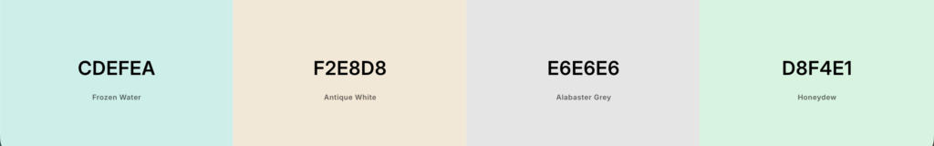
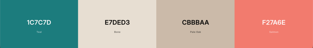
Distinctive: mineral teal primary, warm stone neutrals, coral accent; clear contrast pairs. Consequently, the brand feels alive yet calm.
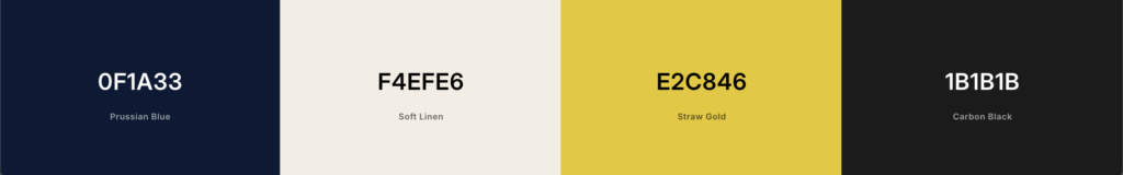
Creative consultant
Generic: cobalt + white + black; stock accents.
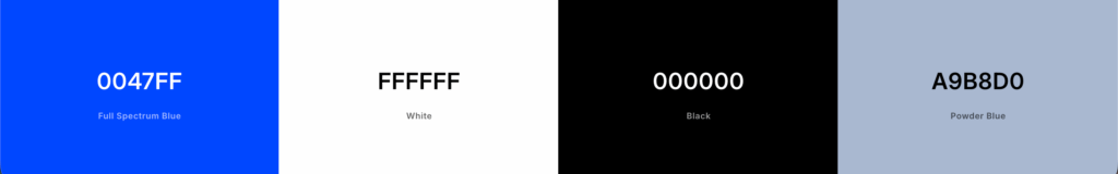
Distinctive: deep ink-navy, soft bone, and a citrine accent used only for CTAs. Therefore, the site reads premium, modern, and unmistakable.
For application alignment between site and brand, see Why Your Website Must Match Your Branding.
Next Steps: Keep Your Palette Working
➡️ Document HEX, roles, and ratios in your brand manual.
➡️ Create a component library (buttons, links, tags, alerts).
➡️ Test new assets against contrast and role rules before publishing.
➡️ Re-evaluate quarterly; then adjust accent usage if it loses impact.
If you want a palette that looks beautiful and behaves beautifully, I can help. ✨ Explore my Brand Identity Design and Web Design approach on the services page — we’ll shape a color system that feels like you and converts with clarity.
No responses yet