Brand Identity Design Services: What’s Included and Why It Matters
If you’re considering brand identity design services, you’re likely past “just a logo.” You want a system that looks premium, reads clearly, and scales across web, print, and social. Moreover, you want a process that’s organized, human, and genuinely useful for your next launch. Consequently, this guide breaks down what’s included, how it works, and why a strong identity saves time (and budget) later.
Brand Identity Design Services: What’s Actually Included
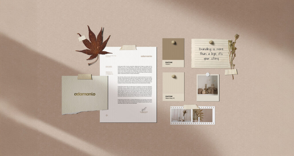
A proper identity is a toolkit, not a single file. Therefore, I structure projects so you leave with assets you can use tomorrow.
- Logo system (primary, stacked, mark-only, monochrome).
- Color palette with contrast guidance and usage notes.
- Typography (headlines/body), hierarchy, and spacing rules.
- Style guide (clear space, minimum sizes, do/don’t).
- Applications (business cards, social templates, simple doc layouts).
- File package (vectors + labeled exports for light/dark).
- Handoff session so your team knows how to apply everything confidently.
✅ Result: your brand shows up consistently—on your homepage, pitch deck, and packaging—without second guessing.
The Deliverables, Explained (So You Know What You’re Paying For)
1) Logo system that behaves everywhere
A logo should work tiny first (avatar, favicon) and still feel confident on large surfaces. Additionally, responsive versions prevent stretching and awkward crops.
2) Color with a job
I define a neutral base and one decisive accent—then I test contrast on light and dark. Consequently, buttons, headlines, and images look intentional instead of noisy.
3) Typography that speaks your voice
Type sets the tone. However, legibility wins. Therefore, I pair fonts that read well at body size and feel distinctive at headline size.
4) Rules that save your time
A style guide or a brandbook shows spacing, minimum sizes, and misuses to avoid. Moreover, this compact reference keeps future assets consistent—even if someone new joins later.
5) Real applications, not just theory
You’ll see the identity in context: a slide, a social post, a simple document header. As a result, feedback moves from “I like it” to “this helps us sell.”
6) Clean files, labeled clealry
File hygiene matters. Consequently, I deliver vectors (SVG/PDF/EPS) and PNGs @1x/@2x with names that your team and printer will actually understand.
How the Process Works (Clear, Calm, and Fast) ⏱️
1) Discovery — Smart Questionnaire → Clear Brief
First, I send a comprehensive questionnaire. It captures goals, audience, tone, constraints, and must-haves. Then, I turn your answers into a concise creative brief so decisions stay objective from the start.
2) Direction — Two Moodboards, One Approved Path
Next, I create two distinct moodboards with different visual directions. We review them together; once you approve one, I lock the tone, palette, and type direction. Therefore, design time is focused and efficient.
3) Design & Refinement — Two Proposals → One Polished System
I develop routes, stress-test small sizes, and tune spacing. Moreover, I deliver 2 proposals for review. After your feedback, we choose one direction and I refine it deeply—clarity first, craft always.
4) Applications & Guide — Real Context, Practical Rules
Then, I assemble the system, build key mockups (e.g., website header, slide, social), and finalize a concise style guide: clear space, minimum sizes, color/type usage, and quick do/don’t examples.
5) Handoff — Files You Can Actually Use
Finally, you receive vector masters and labeled exports for light/dark, plus a short walkthrough. Consequently, your team can apply the identity confidently on day one.
💡 Tip: Decide fast on direction; refine slow on details. Consequently, quality improves and timelines stay healthy.
Why It Matters (Beyond “Looking Nice”) ✨
A cohesive identity reduces friction across teams and channels. Because components are defined, designers and marketers move faster. Moreover, developers get predictable assets. Consequently, your brand looks composed everywhere—building trust with less effort.
- Speed: fewer revisions, quicker campaigns.
- Consistency: one voice across every touchpoint.
- Confidence: partners and customers recognize you faster.
- Savings: no rework due to fuzzy files or unclear rules.
Common Mistakes (and Quick Fixes)
👉🏼 Only buying a logo. Instead, request a logo system and a short guide.
👉🏼 Too many colors. Consequently, the brand feels chaotic; prune to one accent.
👉🏼 Illegible type. Increase body size and line-height; clarity reads as premium.
👉🏼 Inconsistent spacing. Adopt an 8-pt rhythm; suddenly everything feels intentional.
👉🏼 Messy exports. Name files properly and deliver both light/dark variants.
Mini Worksheet: Is Your Brand Ready?
Use this 5-point check before you brief any designer. Because a sharp brief saves money.
- Purpose sentence: “Our identity must signal ___ to ___ in ___.”
- Three adjectives: e.g., calm, modern, assured.
- Top three touchpoints: website, deck, packaging, etc.
- Must-haves: e.g., legal name lockup, avatar clarity at 24px.
- Constraints: timeline, markets, or accessibility needs.
If you can fill this in, you’re ready for brand identity design services that actually fit your stage.
FAQ (Founder Edition)
Do I need a full brand book? Not always. However, a concise guide prevents drift.
Can I start lean and expand? Yes; start with essentials, then add pages when needed.
What about fonts and licenses? I’ll recommend options and flag any licensing requirements.
How long does it take? Typically 8-12 weeks, depending on scope and feedback rhythm.
A good identity doesn’t shout; it aligns. Because your team shares the same visual language, every asset feels like “us.” Moreover, clients sense that clarity immediately, which is exactly why this investment multiplies later.
Ready to turn your look into a usable system? I’ll outline the right brand identity design services package—scope, timeline, and deliverables—so you can launch confidently.
No responses yet